Google Tasks
Bringing flexible organization to Google Tasks
Google Tasks is the simplest task app Google makes — and the first one people outgrow. This project asked how it could hold more of real life without losing the lightness that makes people reach for it in the first place.
The answer wasn't more features. It was organization that bends to the day you're having, built entirely from patterns Google users already know. Over seven weeks I ran interviews, competitor and app audits, and two rounds of testing to design a way to group, sort, and move tasks that feels discovered rather than learned.
See the PresentationProblem Space
One list, every kind of life. Work, errands, coursework, and someday-maybes all pile into a single stream with no way to group them, sort them, or shift focus.
Every person I spoke to said a version of the same thing: the app is great at catching a task and useless at helping them decide what to actually do next. So the real planning happened in their heads — the tool held the list, but never the priorities.
Solution
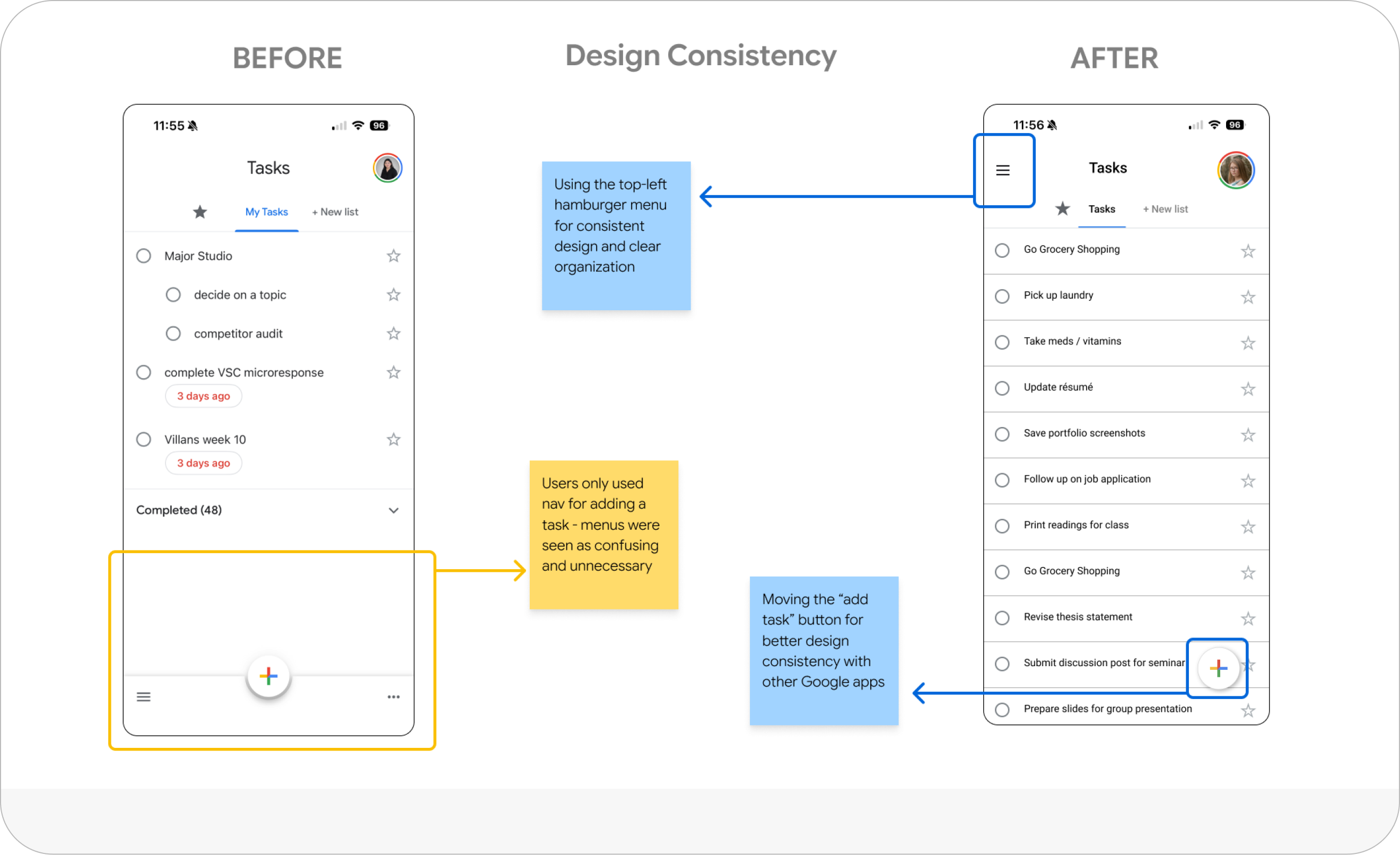
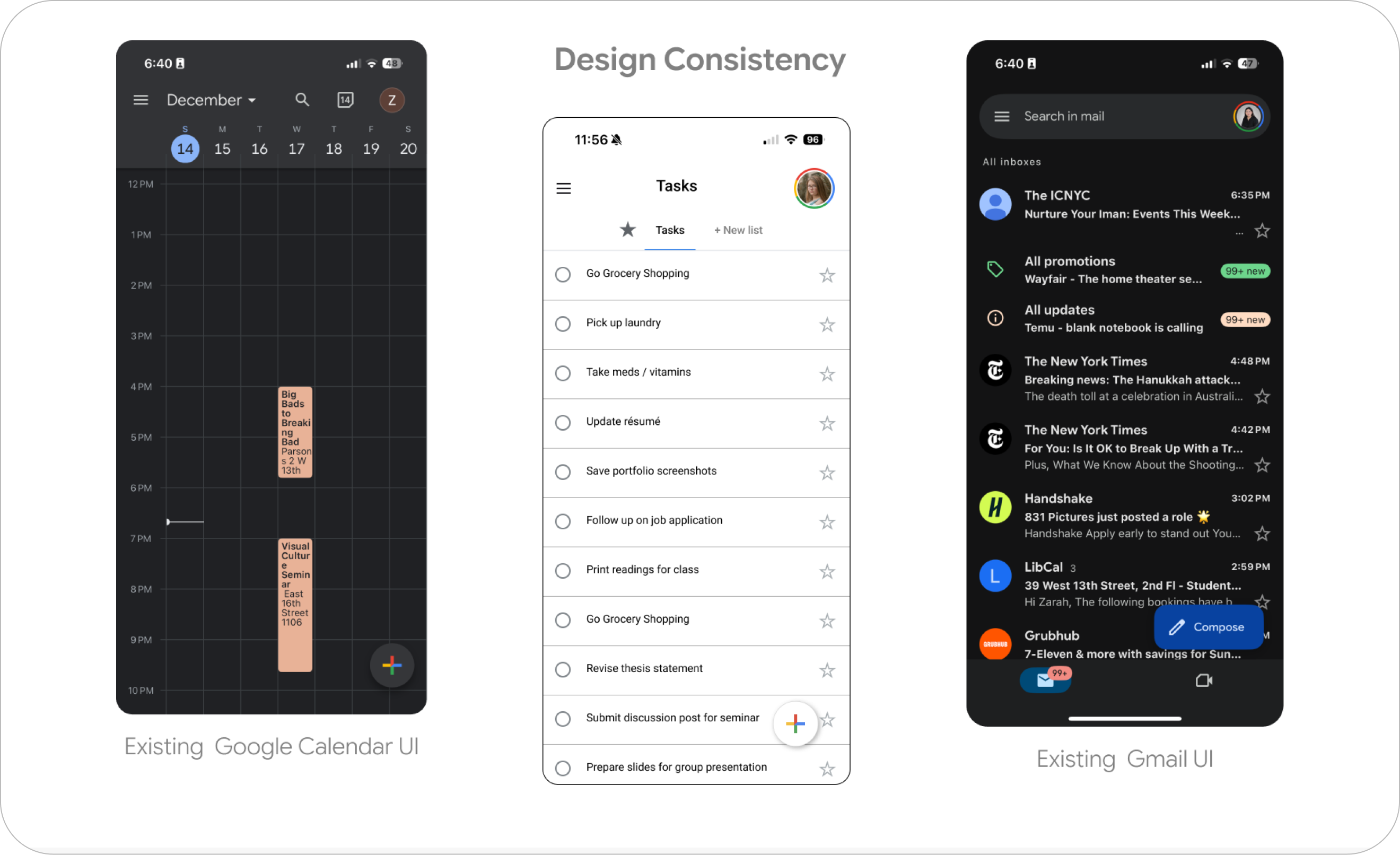
Familiar on top, flexible underneath. I audited Calendar, Gmail, and Keep and found one consistent grammar — side-panel navigation, small section headings, and a persistent "+" for adding things. Google Tasks was the outlier that had never adopted it. So the redesign borrows that grammar wholesale, which means new organization lives exactly where a Google user already expects to find it. It reads as recognition, not a feature to learn.
Small changes, big legibility. Moving to the top-left hamburger menu and relocating the add button turned a flat, ambiguous list into a screen whose structure you can read at a glance — and put both controls where every other Google app already keeps them.
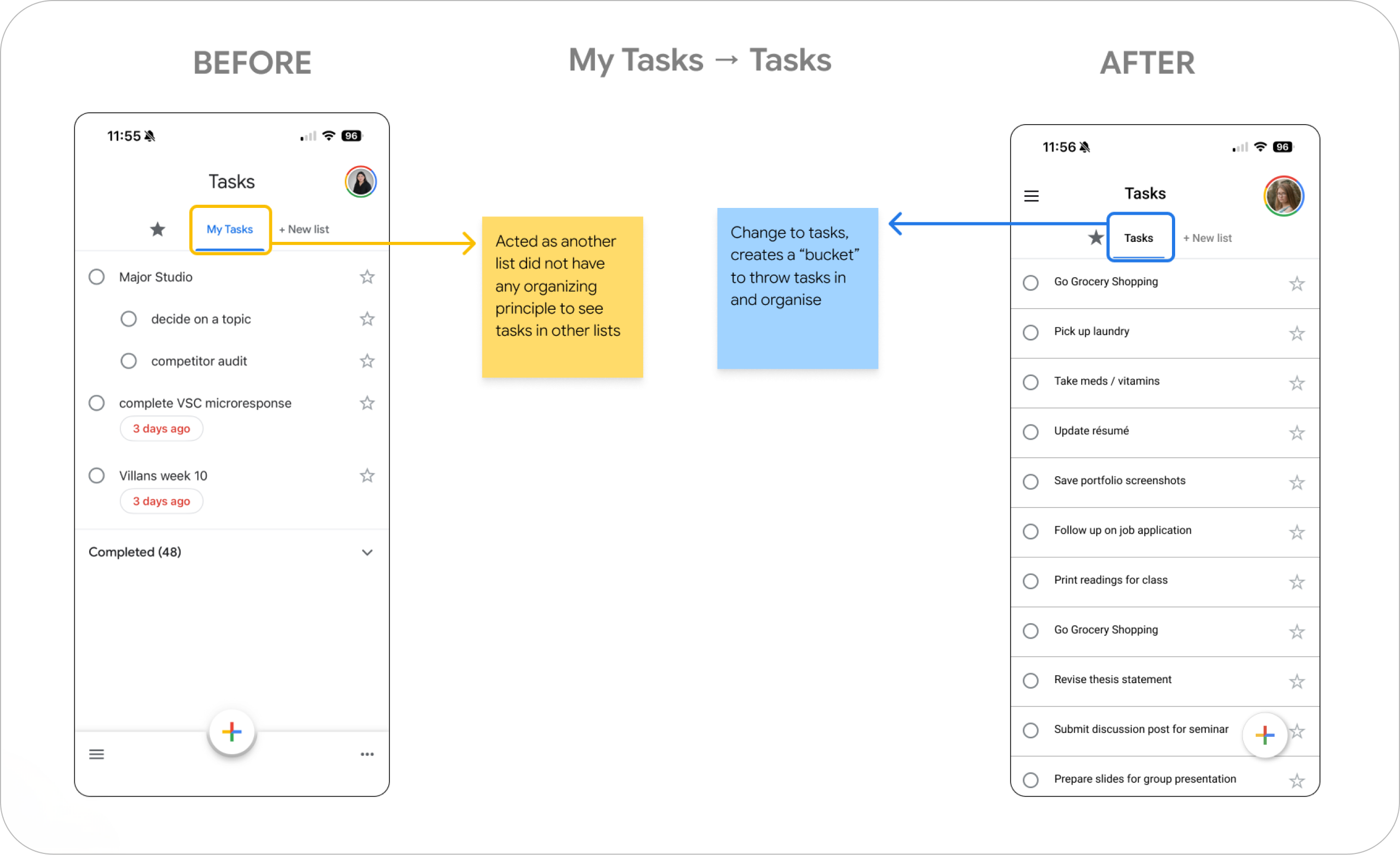
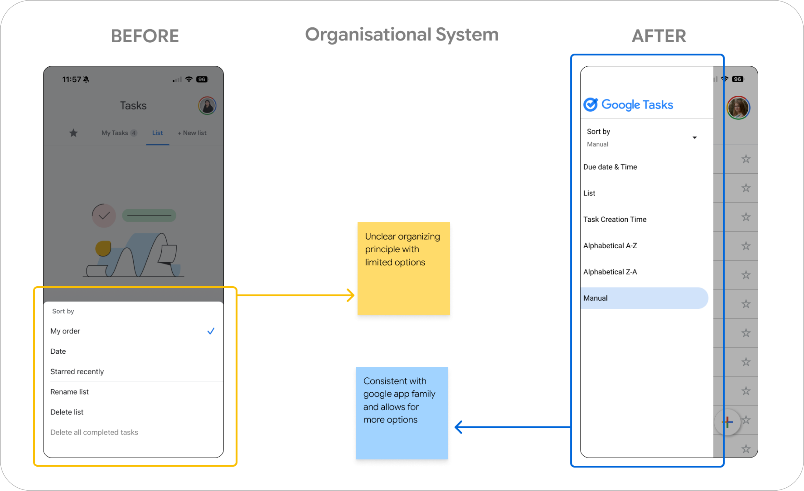
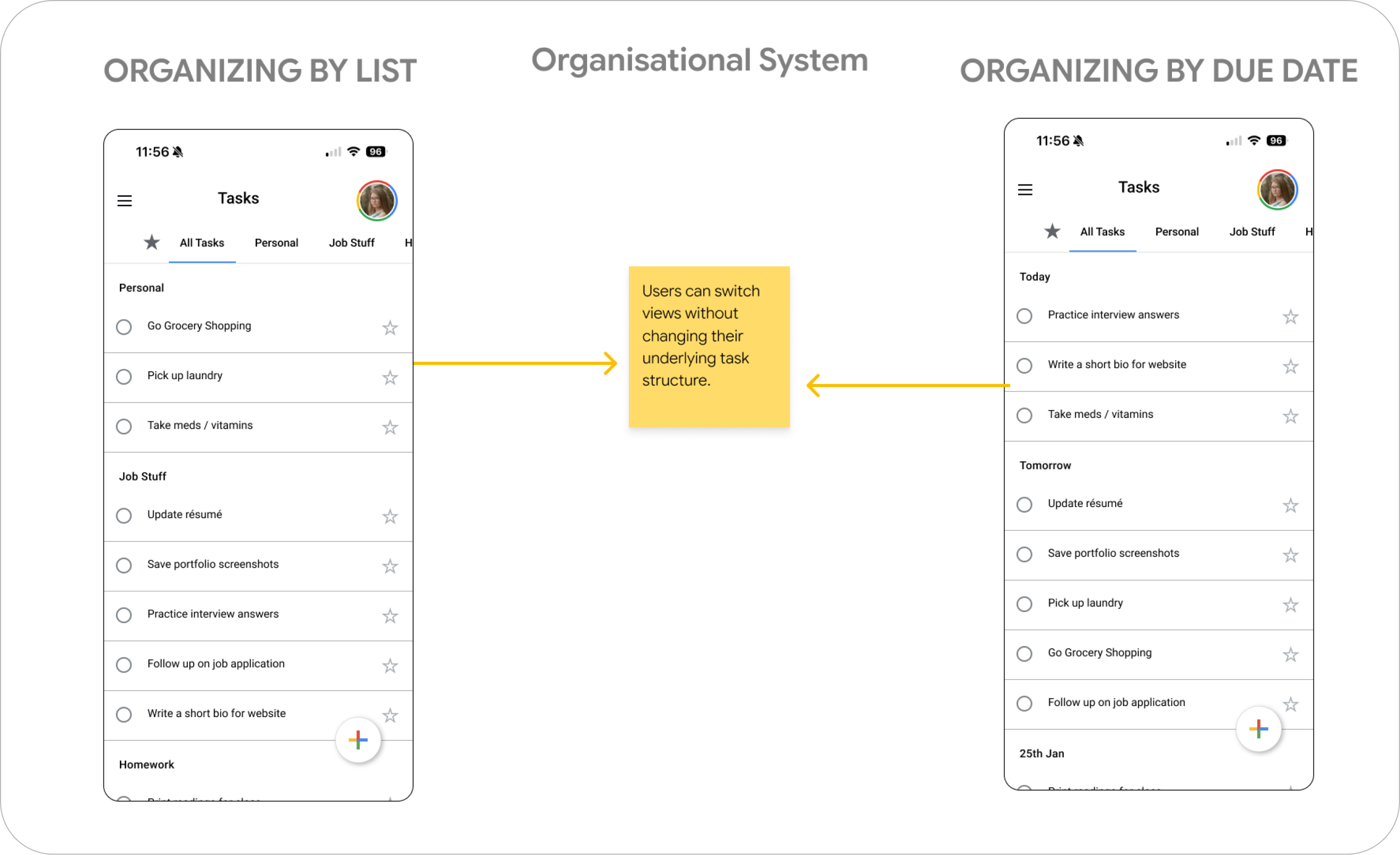
Group it your way. Tasks can now be organized by list or by due date, and switched between the two without changing the underlying task structure — the same tasks, reshaped around whatever today needs. Sorting moves into Google's own sort-by menu, which both widens the options and makes them findable.
Process
I ran four types of research before designing anything: user interviews, an audit of Google Tasks, a competitor audit, and secondary research across Reddit and published case studies. Four participants across Google Tasks, Apple Reminders, and Notion showed a consistent pattern — everyone captured quickly, everyone planned mentally, and no one felt their app helped them choose what mattered now.
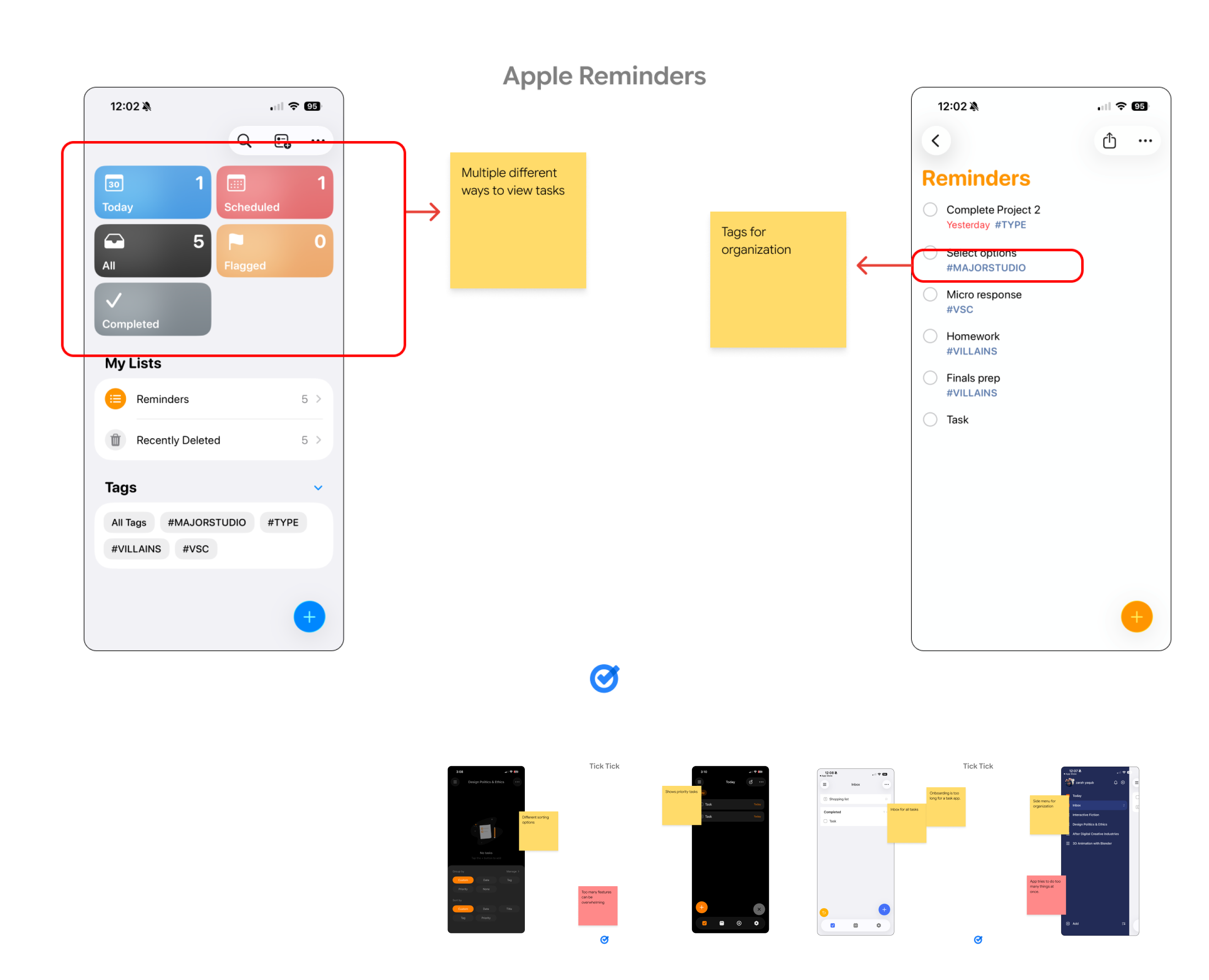
The competitors drew the boundaries of the problem. TickTick buys flexibility at the cost of simplicity; Apple Reminders hides its power behind complexity. Neither offered flexible and simple at once. Google Tasks' simplicity wasn't a weakness to fix — it was the thing to protect.
That research converged into three insights, each driving a design question:
- Organization isn't static — needs shift day to day. How might we build a system that adapts to changing priorities?
- Discoverability follows familiarity — people look for organization where Google usually puts it. How might we align with existing Google navigation patterns?
- Control and simplicity are in tension — people want more say without more clutter. How might we offer flexibility without complexity?
Then I tested in two rounds — three participants early, two more once the organizational system took shape — spanning students, working professionals, and parents. Phase one confirmed the appetite for flexible views. Phase two pressure-tested whether the Google-borrowed patterns actually made those views discoverable. They did: people reached for organization where they expected it, without being told it was there.
Design Documentation
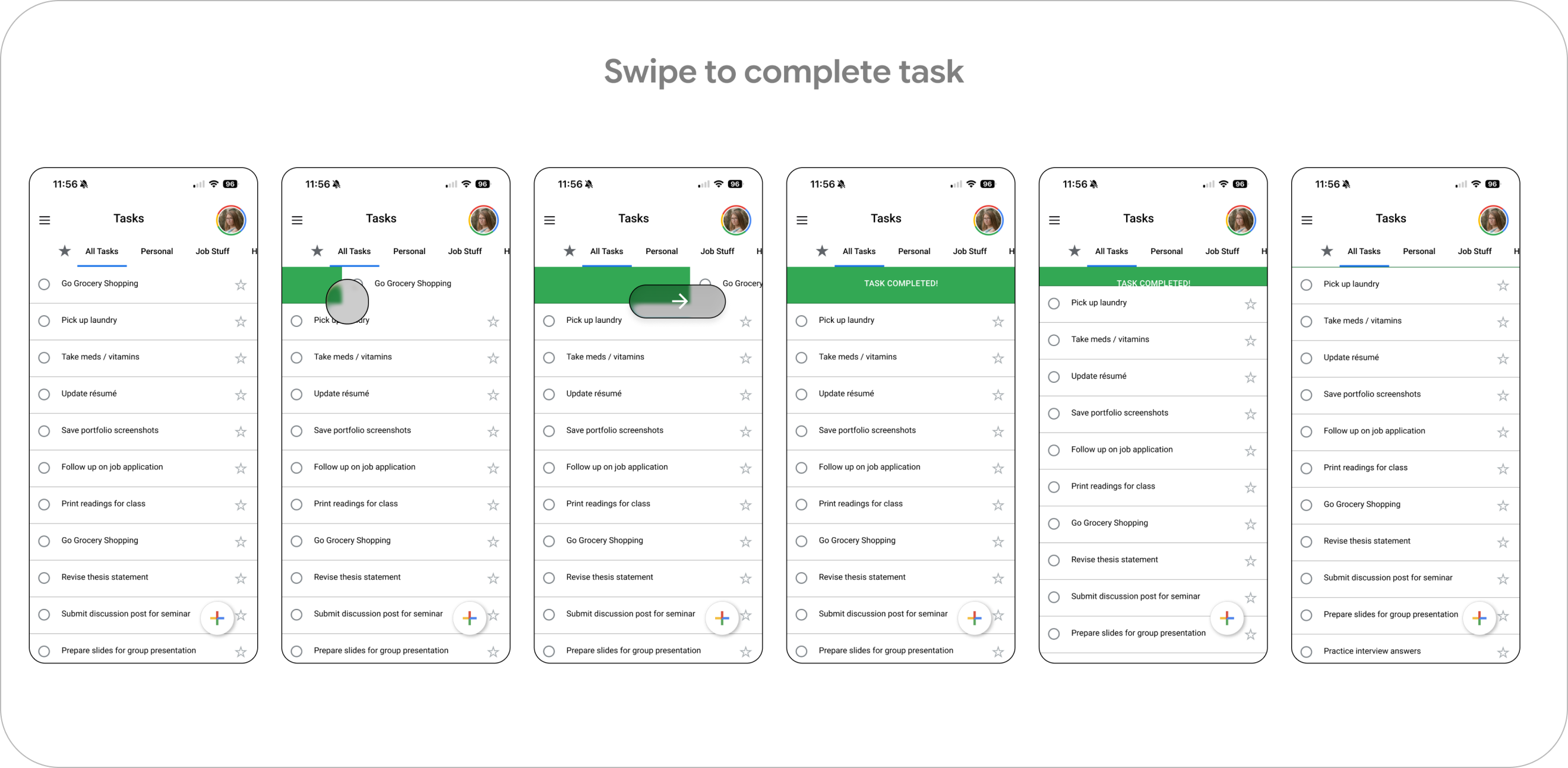
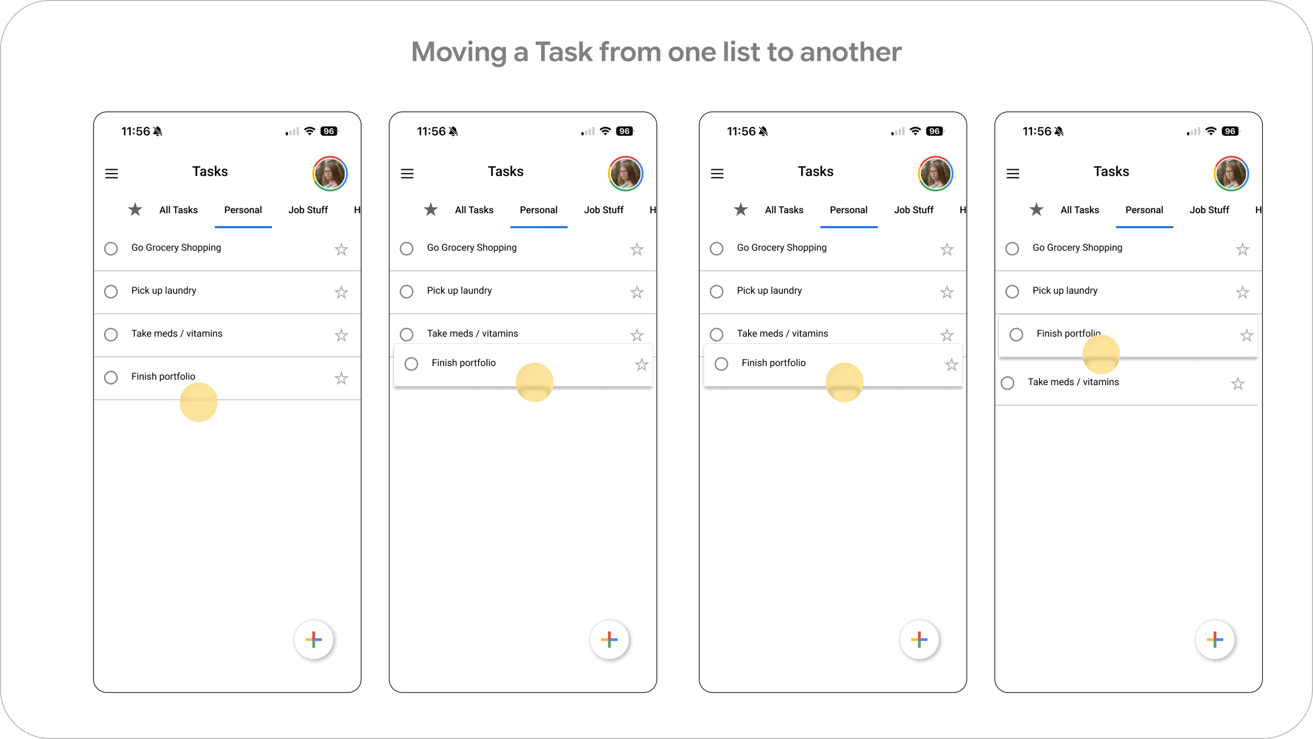
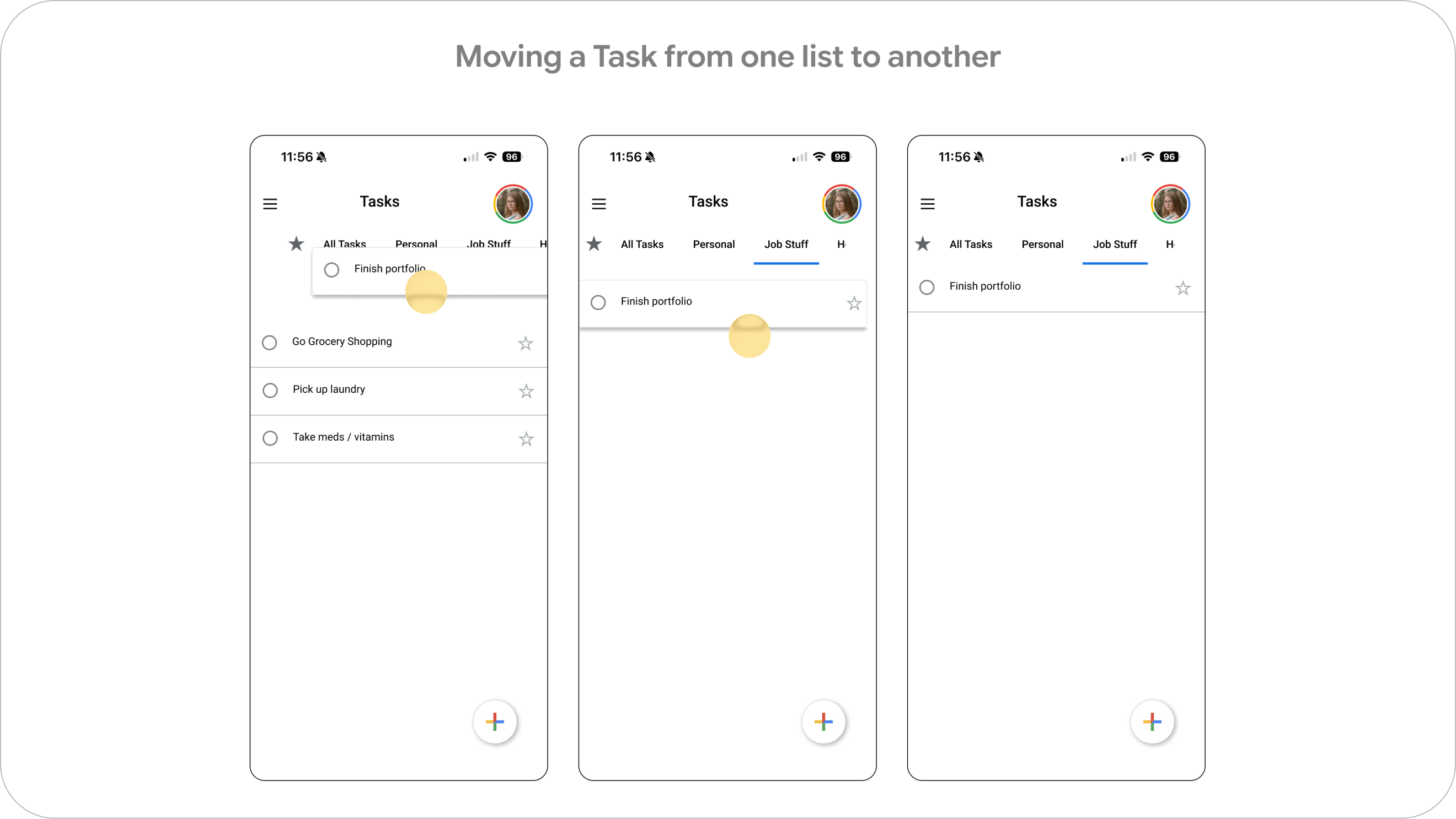
The details carry the feeling. Swipe to complete gives a task a satisfying, unmistakable close — and moving a task from one list to another is a direct drag, no menus, no dialogs.
Reflection
Organization isn't one thing. Needs change day to day, so people don't want the one right structure handed to them — they want to switch structures without friction. As one tester, Riya, put it: "I change my view on tasks every day. Sometimes I want to see the ones due in the next week, sometimes I want to see them by class. It changes every day."
Two more findings shaped the direction, and both still guide where this goes next: users lean on familiar Google interaction patterns to know where organization lives, and when those patterns are missing, features simply go undiscovered — but pile on too many options at once and the whole thing feels overwhelming. Restraint was the hardest part of the work.
- Deeper integration with Google Calendar for time-based task planning
- Subtle task-completion feedback to reinforce a sense of progress
- Further testing to refine the default organizational behavior
Outcome
Structure that keeps up. Tasks stopped being one long stream and became a view you can reshape in a tap — more control, no new vocabulary. It stays loyal to Google's design language while finally answering the question users were really asking: not "what's on my list," but "what should I look at right now."