Nura
Designing to ease the burden of dementia caregiving
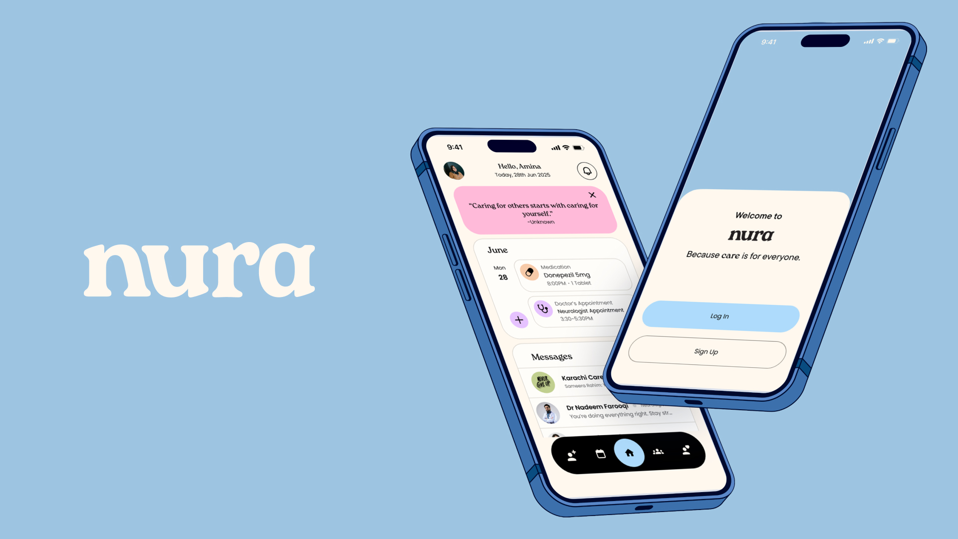
Nura is a calm companion for families navigating dementia caregiving at home. The daily work of supporting a loved one — tracking routines, managing medications, coordinating with clinicians, and holding space for grief — often falls on one person with tools that were never designed for this kind of care.
I designed Nura to reduce the cognitive load of caregiving without reducing the humanity of it. The interface favors gentle prompts over alerts, shared visibility over solo responsibility, and plain language over clinical jargon — so caregivers can stay present with the person in front of them, not buried in the app.
Problem Space
Care between appointments falls through the cracks. The hardest part of dementia caregiving isn't the clinic visit — it's the everyday rhythm of monitoring, remembering, and adapting as needs change. Existing tools treated caregivers like data-entry clerks for someone else's health.

The Insight
Design for the person behind the person. Every existing tool pointed its attention at the patient — medications taken, symptoms logged — and treated the caregiver as the unpaid clerk entering it all. But the one quietly breaking under the weight wasn't the patient. It was the one keeping track.
The reframe was simple and it changed everything: design for the caregiver's load first, and let the patient's data fall out of a gentler routine — not the other way around.
Solution
Soft edges, honest data. Nura asks for less, more kindly: one tap to log how the day went, a routine that adapts instead of nagging, and a tone that never scolds a missed task. Underneath the calm surface, the data is rigorous — clean enough to bring to a doctor, gentle enough to keep up with.


Living With Nura
To make this real, I followed one caregiver through an ordinary day.
Morning starts before anyone is ready. Nura surfaces the day's routine as a single gentle prompt — what to remember, not everything at once — so the first hour isn't spent bracing for what might be forgotten.


By evening the work is emotional as much as logistical. One tap logs how the day actually went, and Nura holds that context so nothing has to be carried in someone's head overnight.

The Design System
The system is built to lower the temperature. Rounded forms, generous space, and warm neutrals keep the interface from ever feeling clinical or urgent.
Language does as much work as layout. Nura speaks in plain, non-judgmental terms — no red badges, no streaks to break, no scolding for a missed task.
Underneath, the data stays rigorous and structured, so what feels gentle to a caregiver is still clean enough to hand to a clinician.


Impact
In testing, caregivers described Nura as a companion rather than a tracker — the exact shift the project set out to prove.
Reflection
Designing for care meant designing for the person behind the person — the caregiver whose needs are usually invisible in health tools. The hardest choices were about what to leave out.


Outcome
Consistency without pressure. The design made space for the emotional weight of the work, not just the logistics.
Nura became a thesis about care as a design constraint — proof that rigor and gentleness don't have to trade off against each other.

