Spring 2025 · 7 weeks
Reimagining productivity & functionality in Google Tasks
Bringing new functionality to a beloved app
- Context & Problem
- Google Tasks captures tasks quickly but gives people almost no way to organize them afterwards. Sorting is limited, lists don’t talk to each other, and it’s the first Google app people outgrow.
- The fix wasn’t more features. It was organization that bends to the day you’re having.
- Role & Constraints
- Solo product designer and researcher over seven weeks: 4 user interviews, competitor and Google design audits, two rounds of testing. Constraint: no new taxonomy, everything had to feel native to Google.
- Outcome & Impact
- A sort-and-group system built entirely from existing Google patterns
- Validated with participants inside (22–25) and outside (29, 56) the original demographic
Overview
Google Tasks is the simplest task app Google makes, and the first one people outgrow. This project asked how it could hold more of real life without losing the lightness that makes people reach for it in the first place.
The answer wasn’t more features. It was organization that bends to the day you’re having, built entirely from patterns Google users already know. Over seven weeks I ran interviews, competitor and app audits, and two rounds of testing to design a way to group, sort, and move tasks that feels discovered rather than learned.
The Problem
People capture tasks in Tasks quickly, but the app offers almost no way to organize them afterward. Sorting is limited, lists don’t talk to each other, and there’s no way to see the same tasks a different way on a different day.
Research
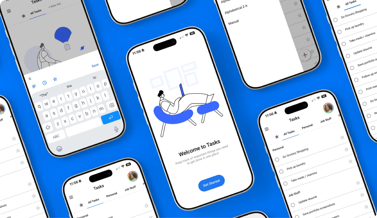
What is Google Tasks?
How do people actually organize their to-dos? Where does Google Tasks stop being useful? And what makes an organizational feature feel native to Google rather than bolted on?
I interviewed four people aged 22–25 across Google Tasks, Notion, and Apple Reminders, students and early professionals juggling coursework and work tasks. Not just what they clicked, but what they were holding in their head while they clicked it. Capture is solved. Deciding what to do next isn’t.
Competitor Audit
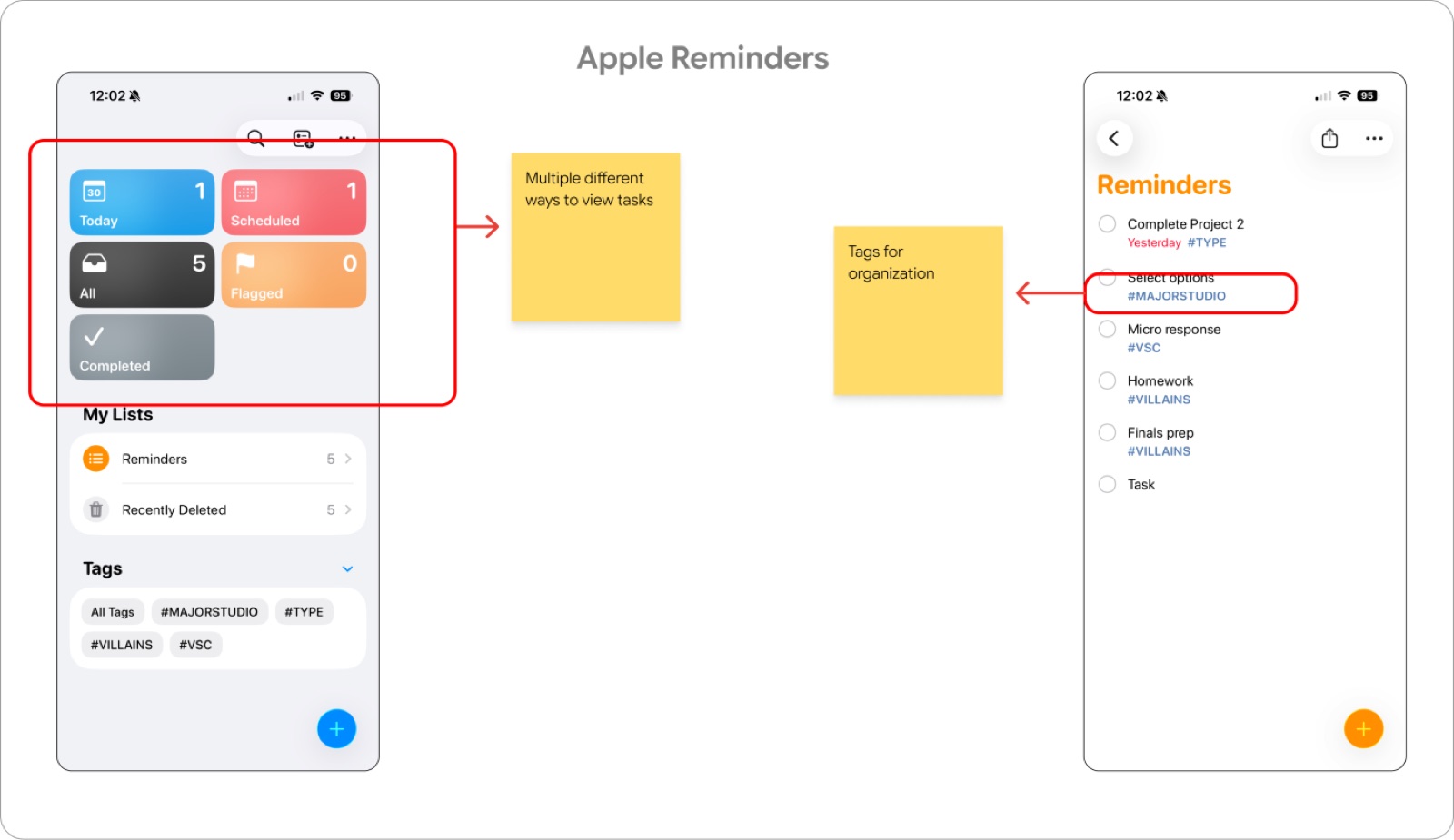
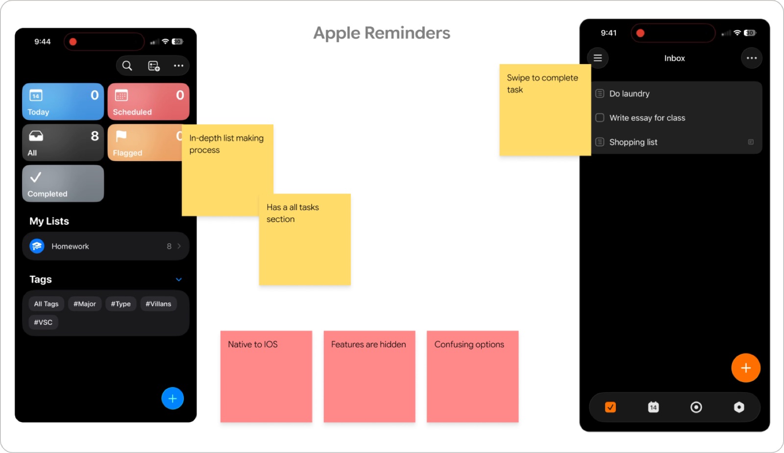
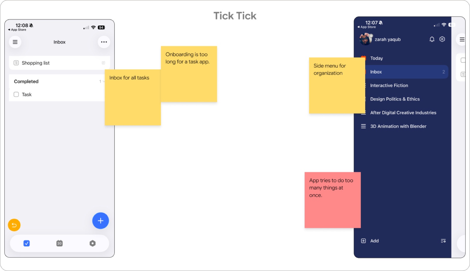
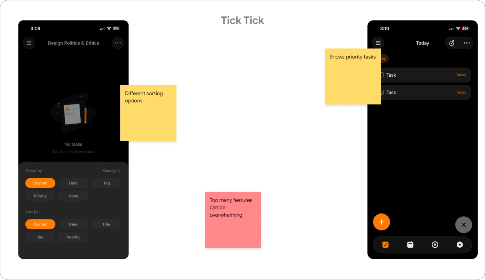
Apple Reminders: offers multiple views and tags, but buries them. Powerful, hidden, confusing. TickTick: offers extensive grouping and sorting, but front-loads it: long onboarding, too many features at once, overwhelming.
Google Design Audit
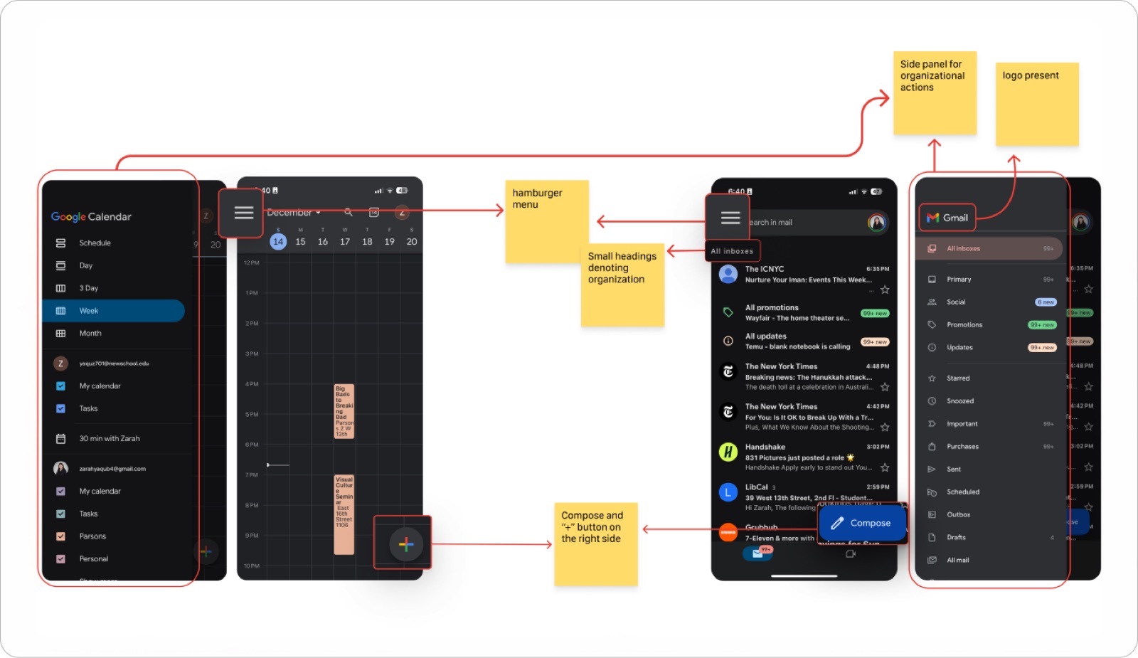
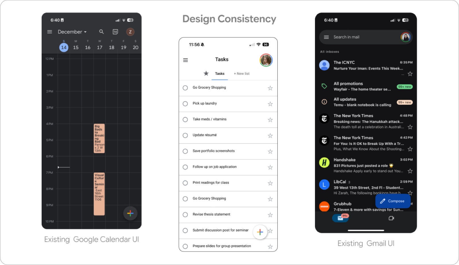
I audited Gmail, Google Calendar, and Google Keep and found consistent patterns: a top-left menu, a bottom-right add button, and a sort panel that behaves the same way everywhere.
The Solution
Google Tasks doesn’t need more features. It needs the ones it has to be findable, flexible, and consistent with the rest of the Google ecosystem.
Rather than adding tags, projects, or a new taxonomy users would have to learn, I borrowed patterns they already knew: a top-left menu, a bottom-right “+”, and a sort panel that behaves like Gmail’s. Familiar structure, expanded capability.
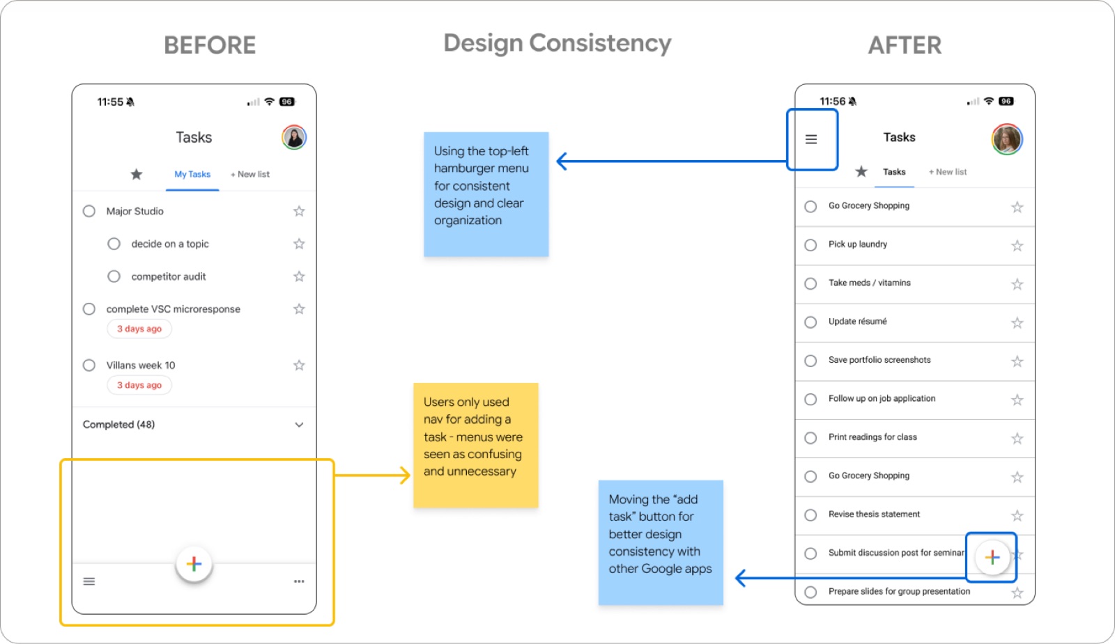
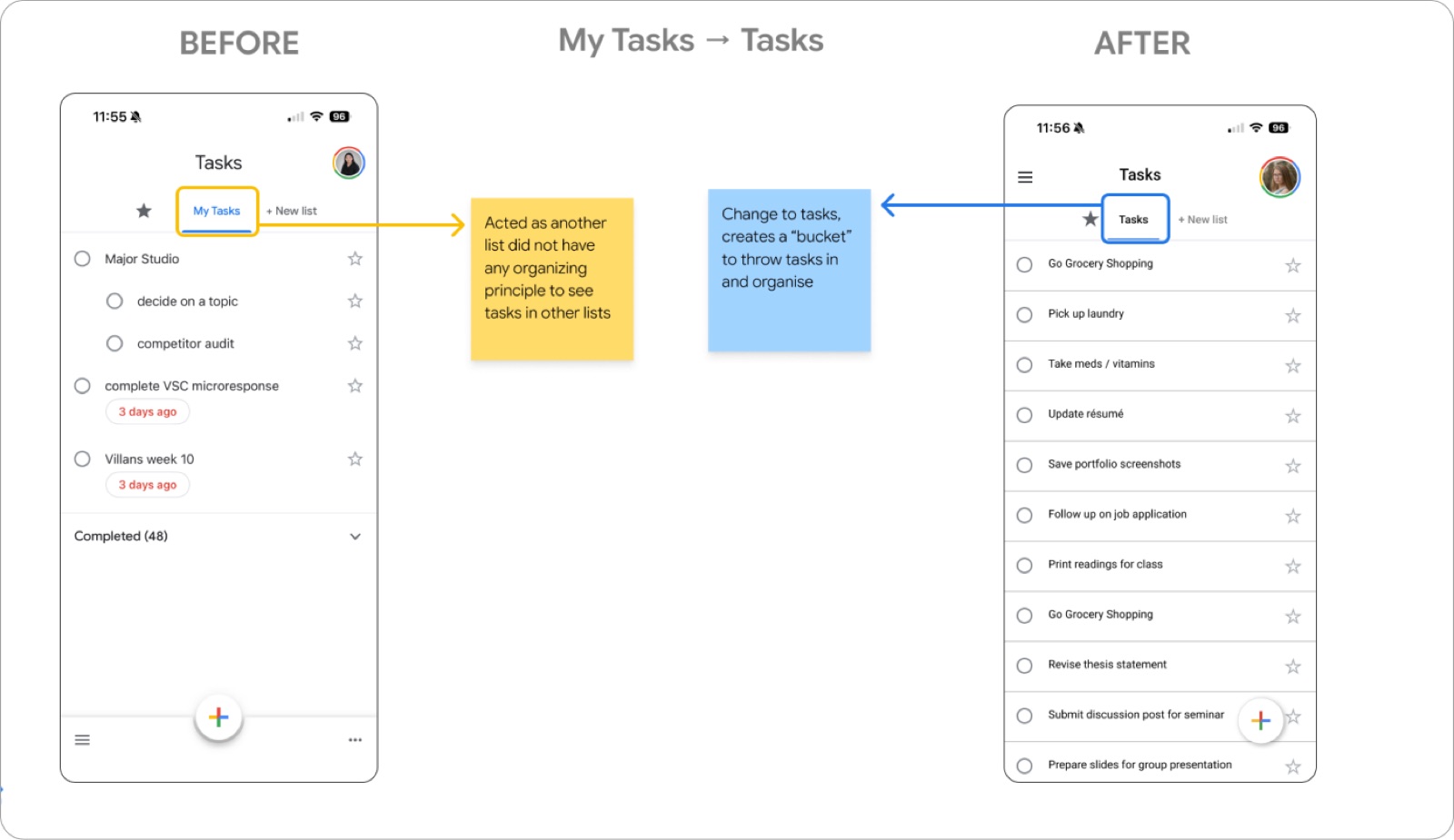
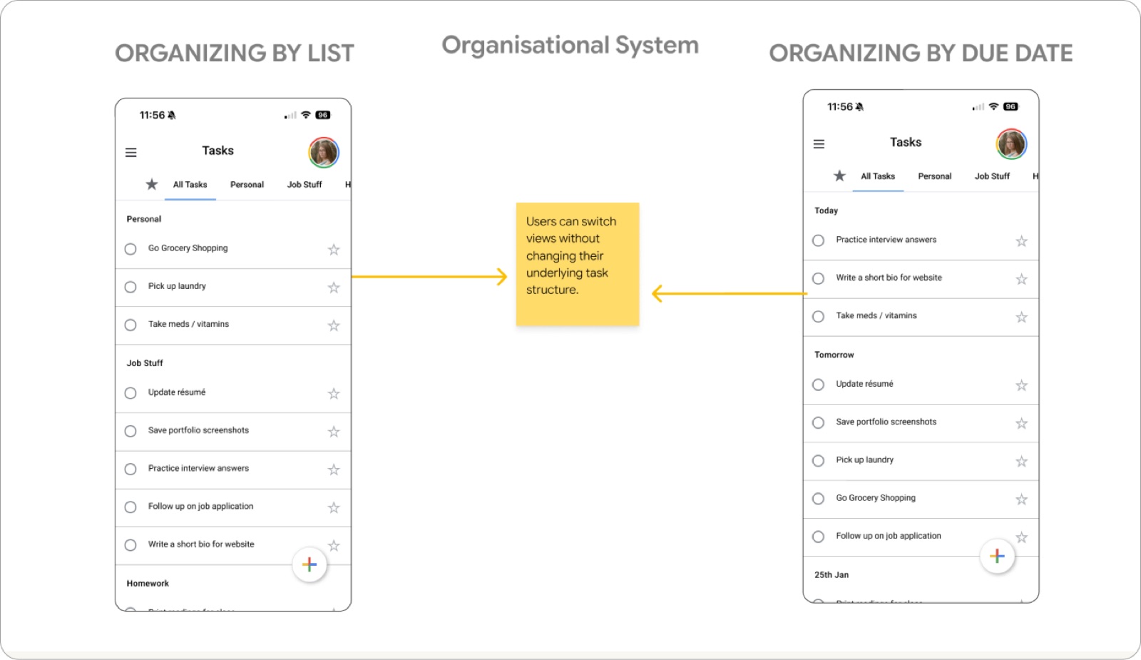
The core change is that organization became a lens, not a commitment. Users can sort by date, list, or creation time, switching views without ever restructuring the tasks underneath.
Testing
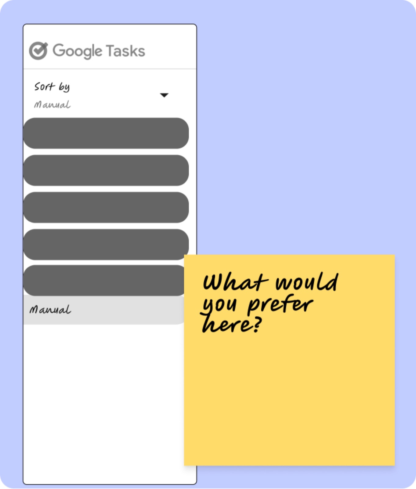
I tested the revised sort menu with two participants outside my original demographic, Aisha (29, mother, Reminders + Siri) and Shazia (56, working professional, Google Keep), to check whether the pattern held for people who weren’t students.
Design Documentation
Beyond the screens, I documented how the organization actually behaves: moving a task from one list to another, and swiping to complete a task.
Reflection
I first treated “make it look like Google” as a restriction, until auditing Gmail, Calendar, and Keep flipped it. The existing pattern was free discoverability. Users already knew where to look; Tasks just wasn’t putting anything there.
I also designed a setting when I should have designed a behavior. Asking users to configure their organization up front is tidy, and wrong. Organization isn’t a decision made once, it’s something people redo constantly, differently, without much thought.
Next Steps
Next time, I’d audit the design system before wireframing rather than spending a testing round to learn my screens didn’t feel like Google.